
Understanding the user flow comes down to understanding the heuristics.

Role.
UX Designer, UX Researcher.
Project Type.
Existing app evaluation.
Timeline.
1 week.
Tools.
Figma, InVision.
Introduction.
AllTrails mobile app is a product to help people navigate the outdoors better.
With features ranging from planning and navigating, while including activities spanning bird watching and hiking - AllTrails is a database of knowledge for the recreational user.
Focus.
With the huge increase of people going to the trails, we want to ensure the AllTrails mobile app offers the best functionality for everyone.
That starts with the user’s overall experience while using the app and working to mitigate any confusion that may lead them down the wrong path.
TITLE
TITLE
What are heuristics?
A heuristic evaluation is a way to measure and grade the ability for a user to functionally complete a task. Think of it as a site/app analysis for usability.
For our project, we performed a full heuristic evaluation for the AllTrails app and found problems in the select usability fields below. We chose to focus on these core concerns because they are issues with the largest impact.
Usability fields.
Match between system and the real world design.
User control and freedom.
Consistency and standards
Aesthetic and minimalist design.
Error prevention.
Recognition rather than recall.
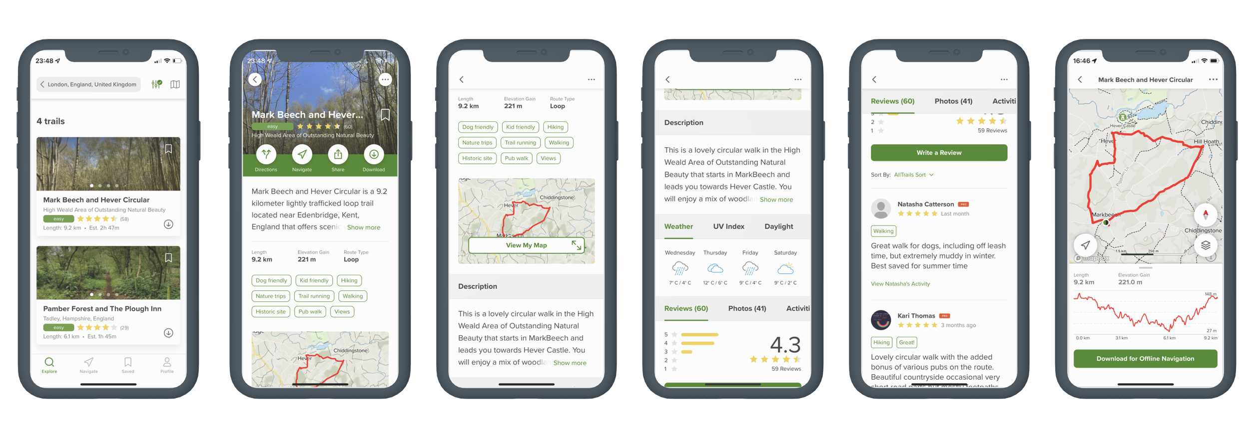
User journey.
In order to assess the usability we came up with a simple task for each member to complete. This allowed us to use and fix any concerns in all the key screens below.
Task : Find a hiking route for a group of friends. It should be within 45 minutes of central London, no more than 3 hours in length, suitable for various fitness levels and end near a pub.
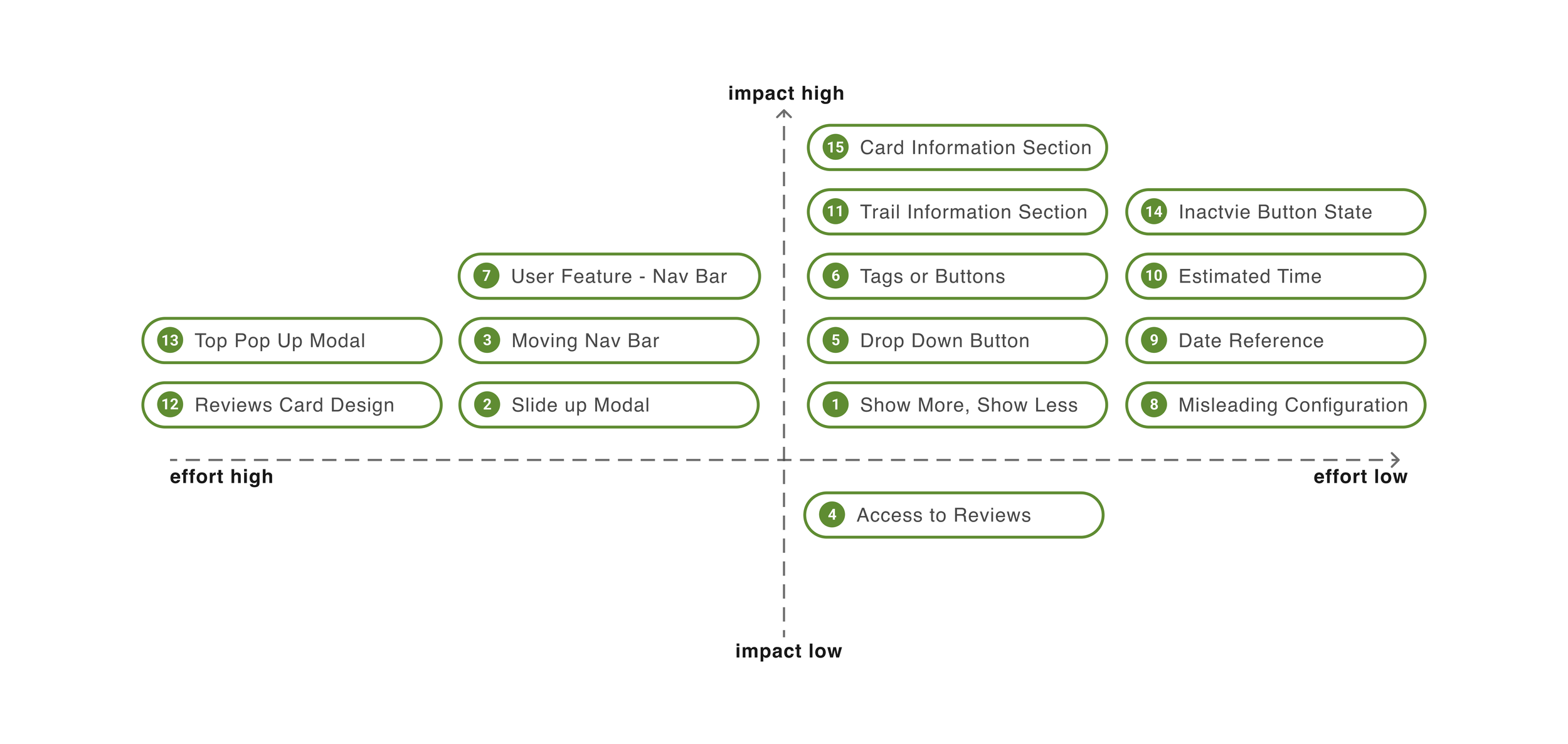
Priorities.
With limited time we needed a way to decide which issues to focus on and redesign. This was accomplished by using a prioritization matrix.
We chose the items that had the highest impact, with the lowest amount of effort to make changes.
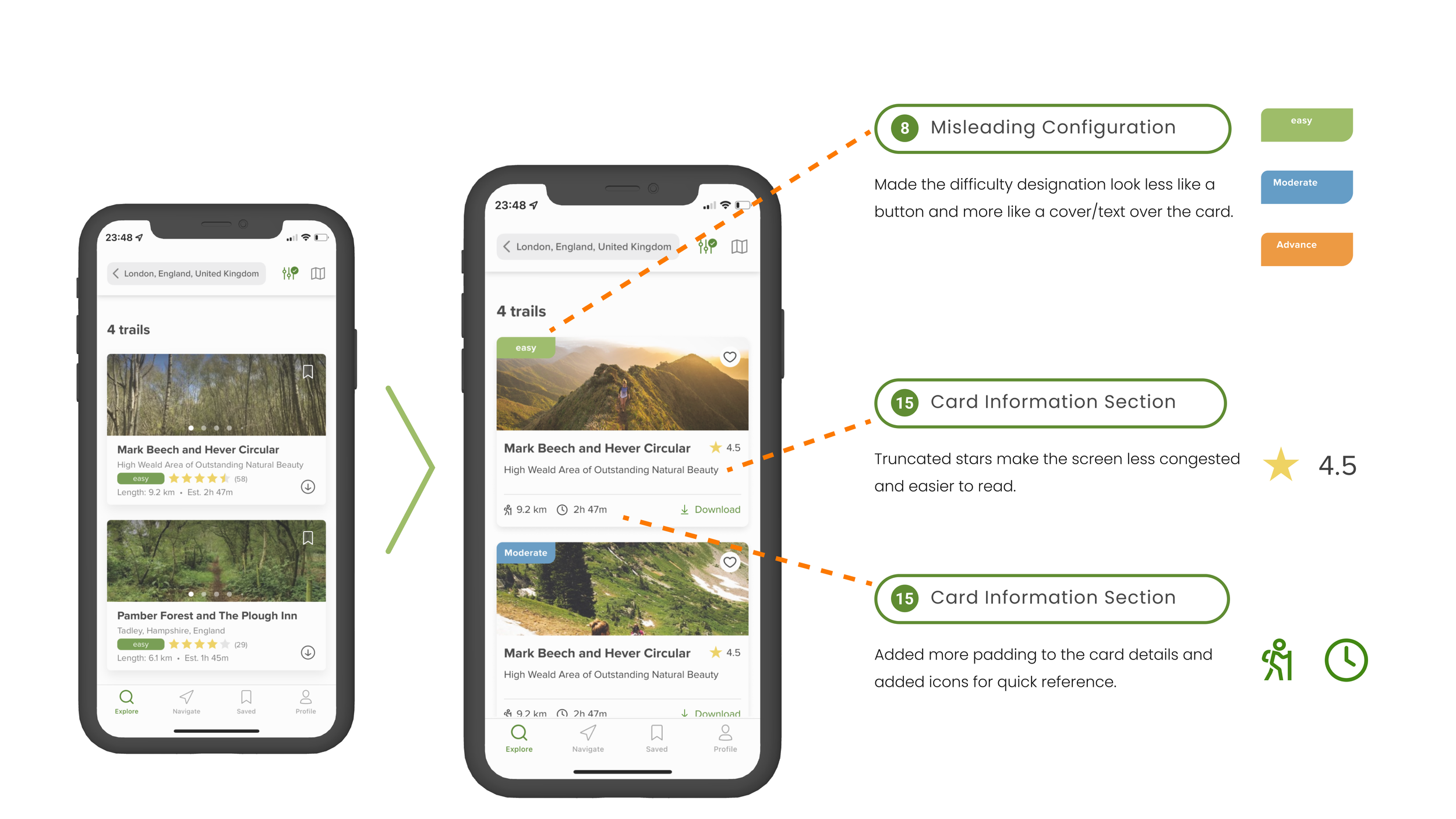
Aesthetic and minimalist design.
Interfaces should not contain information which is irrelevant or rarely needed. Every extra unit of information in an interface competes with the relevant units of information and diminishes their relative visibility.
-
The term “moderate” (especially sitting next to star rating) could be misleading. Is this a moderately rated hike? Is it moderate difficulty? We also received feedback that this appeared to be a clickable button.
The solution was to make things less congested, while making the important factors easier to understand.
-
We noticed some cognitive overload here. Items are much too close to one another and gives off a cramped feeling for the user. Too much information.
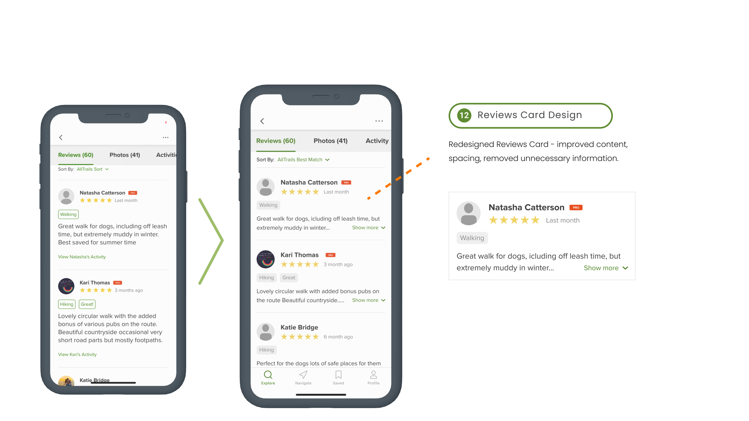
-
The original design defaulted to showing the entire review, with no option to show less. If someone leaves a lengthy review it would take forever to scroll through and is not very helpful for our user.
Our fix includes a “Show More/Less” option for the user and minimizes the space used by each review allowing the user to dive in when they want.
Consistency and standards.
Users should not have to wonder whether different words, situations, or actions mean the same thing. Follow platform and industry conventions.
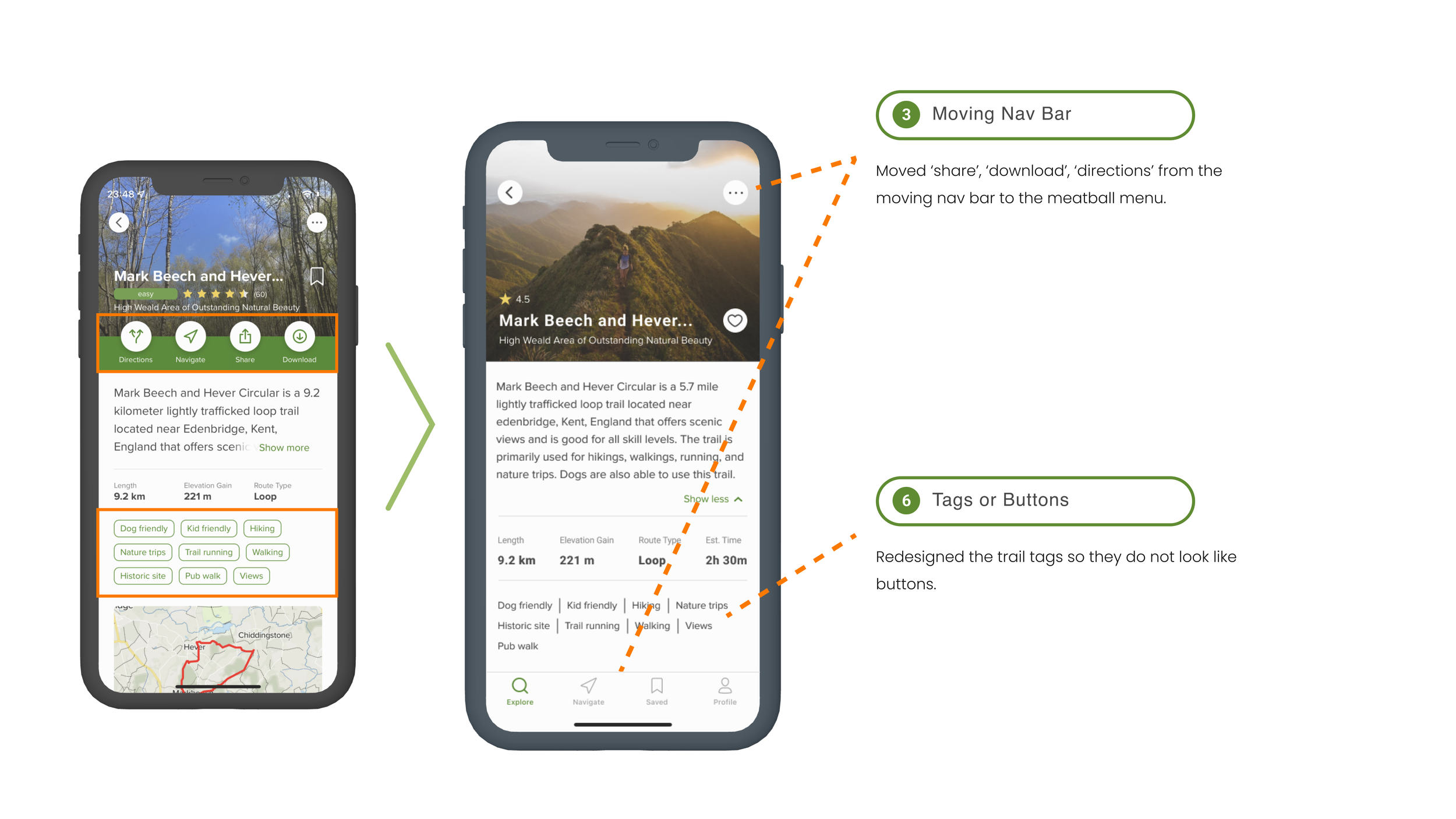
-
Navigation bar changes position from bottom placement to the middle of the screen. This causes confusion and does not follow normal conventions.
Our proposed solution keeps the nav bar at the bottom to adhere to the rest of the site, while allowing users to see common trail options (download, share, etc.) in a well understood meatball drop down menu.
-
These look like filter buttons, but they just show the key words. It is confusing, as the intuitive action would be to tap on them.
We simplified this by making it look more like plain text and trail keywords which does not push the user to interact.
Error prevention.
Good error messages are important, but the best designs carefully prevent problems from occurring in the first place. Either eliminate error-prone conditions, or check for them and present users with a confirmation option before they commit to the action.
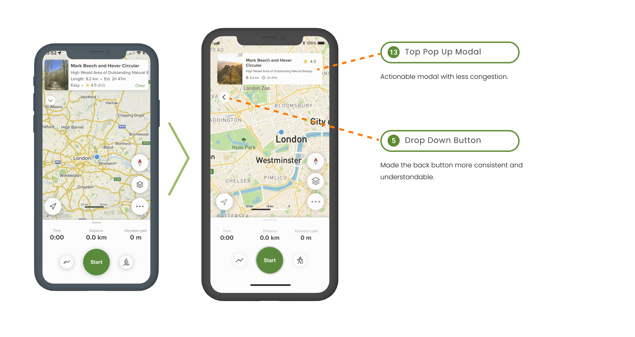
-
This modal can have images ranging from people to ambiguous pictures (assuming it shows the initial image ever uploaded). The modal is also unclickable, leading to “why is this here” or “what does this do”?
We firstly made this an actionable modal. Meaning you can navigate back to the overview screen and review data or descriptions if needed.
-
This was a simple error that had to do with the direction of the arrow. A downward pointing arrow is assumed to incorporate a dropdown menu or download. When in fact it was just a back button.
Simple fix to prevent errors - make the arrow point back, since this is where it takes the user.
Recognition rather than recall.
Minimize the user's memory load by making elements, actions, and options visible. The user should not have to remember information from one part of the interface to another. Information required to use the design (e.g. field labels or menu items) should be visible or easily retrievable when needed.
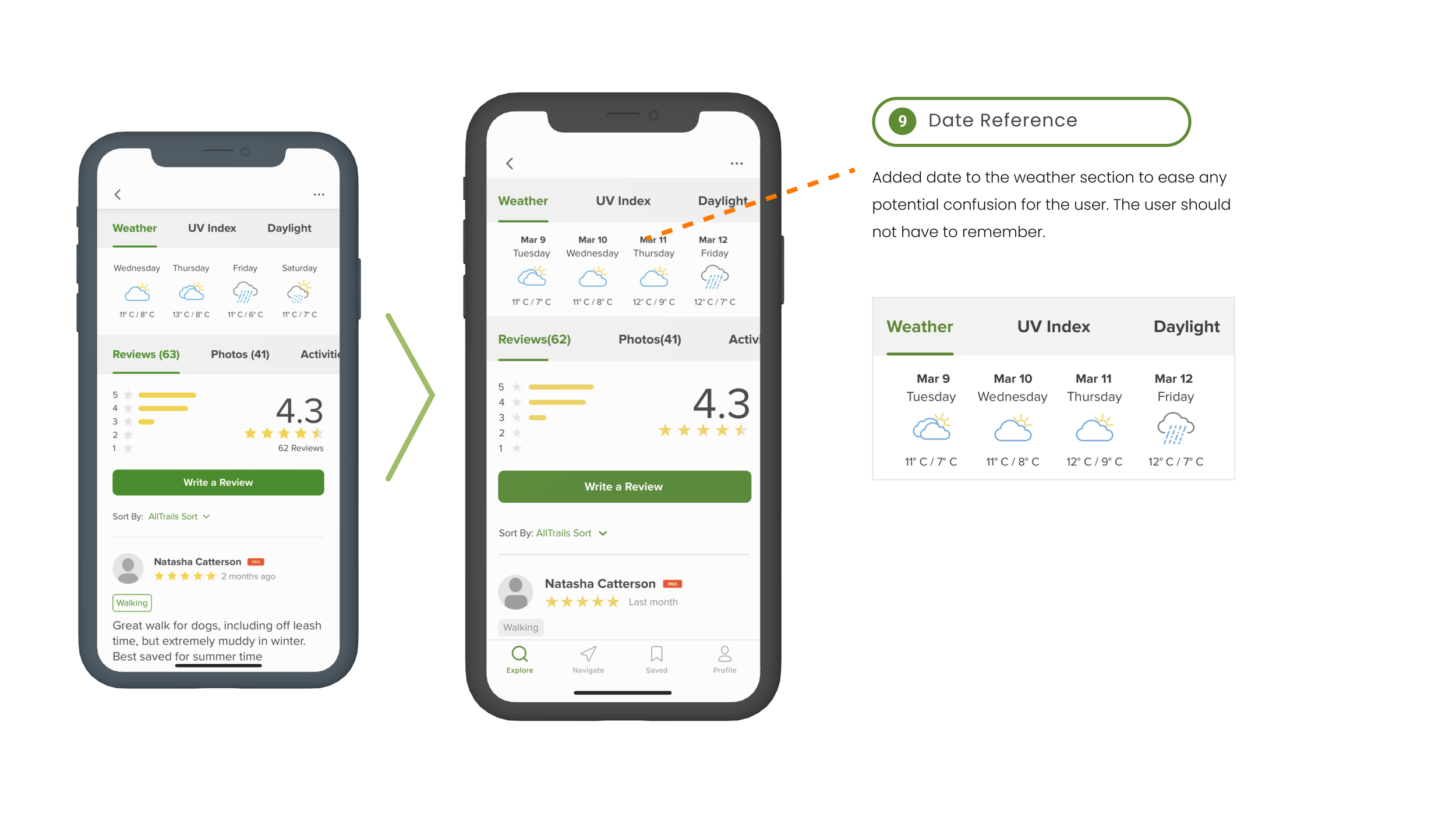
-
No date included, which can lead to unnecessary ambiguity for the user.
Our solution was simple, design a view that incorporates the surrounding dates and make it easier to recall than the current design.
-
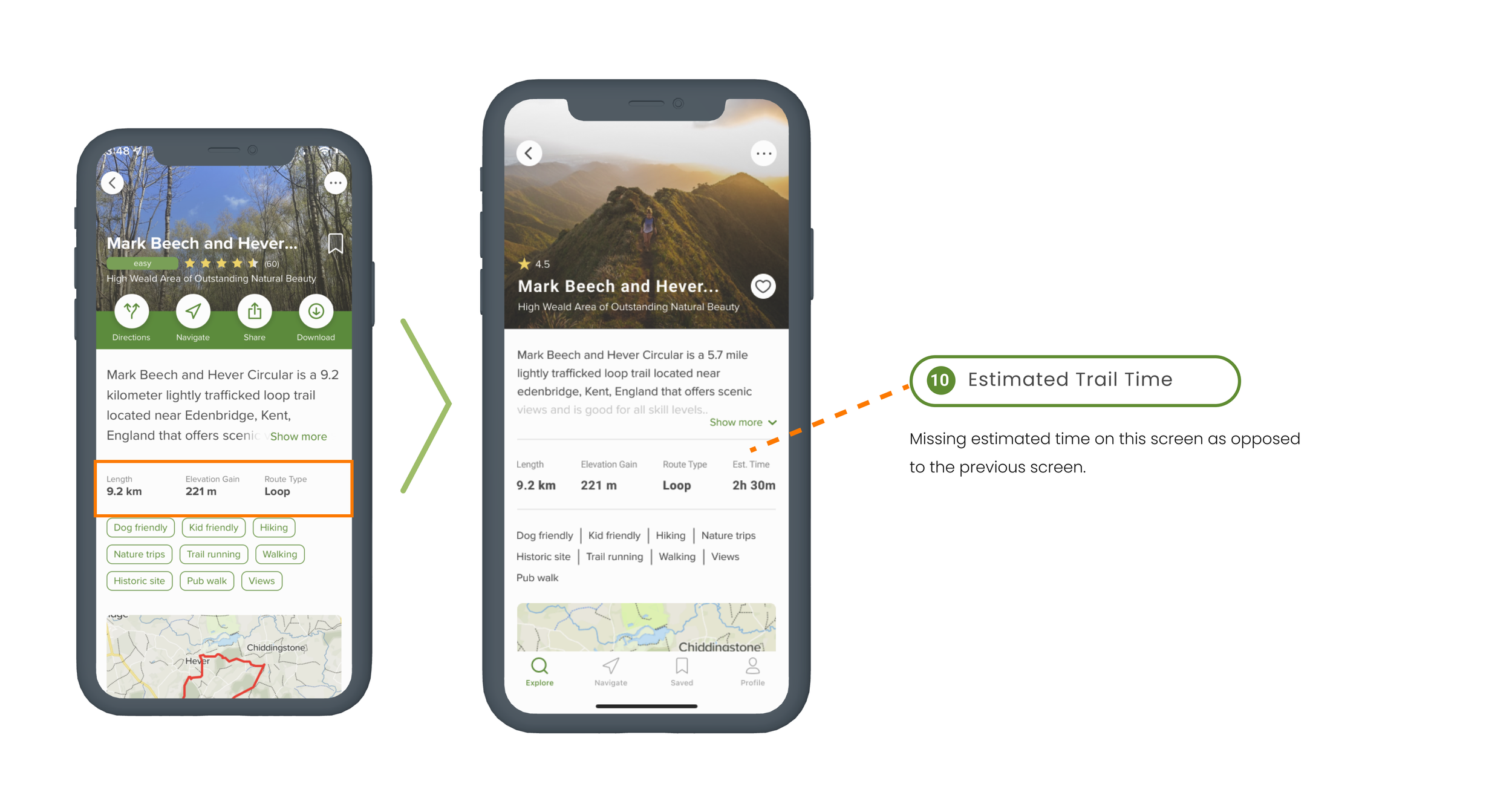
There was no estimated trail time on the most important screen to have the information on. It existed on the screen prior, but disappeared on the details section.
We wanted all the pertinent information available to the user, and made sure it could fit in with length and elevation data.

In the end I found that our redesign helped users reach their goal easier and with less confusion.
By firstly understanding heuristics, and secondly, putting them into practice we were able to achieve a more seamless and effective experience for our user. Reducing confusion by looking at how users interact and preventing error we grasped what needed to be changed and how to accomplish it.
Next steps :
Test the redesign
Refine our designs based off of feedback
Continue to look for ways to improve the user experience based off of further evaluation.