Showpage redesign
Redesigning the launch point for content on the big screen.
Brief
Redesign the current show page to deliver a more immersive experience, improved readability with a clear hierarchy, and tailored show-specific rails for a seamless and engaging user journey.
Narrative
We make products that create emotions and connect people to the content they love. We have the courage to go the extra mile to make things simpler, more task focused and easier to use.
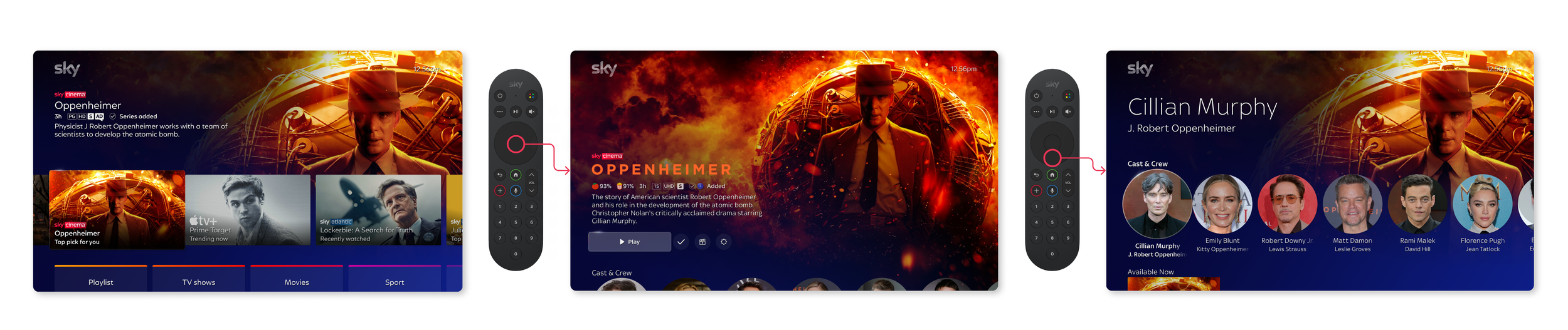
This piece of work focuses on how we can enhance the hero zone (top of the showpage) to be more immersive and task focused. We have considered the hierarchy of components, the introduction of Title art as well as a new action menu.

What is a showpage?
Business requirements
The show page is where the magic happens—it’s the main hub where users launch playback for their chosen content. But it’s more than just a play button. It’s their go-to source for all the important details, like the duration, age rating, and synopsis. Essentially, it’s a one-stop shop for everything they need to know before diving in, making the experience smooth, informed, and hassle-free.

The current EntertainmentOS showpage has some limiting factors when working toward a more immersive experience. Making this heroically simple will allow for a more consistent and navigable showpage.

When users land on the page, we want them to immediately feel like they know what’s available - no guessing. By designing with affordance in mind, we’re giving them a clear, at-a-glance view of their options, whether it’s content, features, or functionality.
At the same time, we’re setting the stage for growth, ensuring the business has plenty of room to expand and add even more options down the line. It’s a win-win: users get clarity now, and the business gets flexibility for the future.
Scalability
We’re setting the stage for growth, ensuring the business has plenty of room to expand and add even more options down the line.
It’s a win-win: users get clarity now, and the business gets flexibility for the future.
User flow
Users have plenty of ways to land on the show page, so we focused on making it crystal clear that useful options are waiting for them (think trailers, formats, and the magic of "watch together"). Plus, they need all the must-know details about the content right there, ready to go.
It’s all about making their experience seamless and keeping everything they need at their fingertips!
What do users want?
When users land on the page, we want them to immediately feel like they know exactly what’s available—no guessing games. By designing with affordance in mind, we’re giving them a clear, at-a-glance view of their options, whether it’s content, features, or functionality.
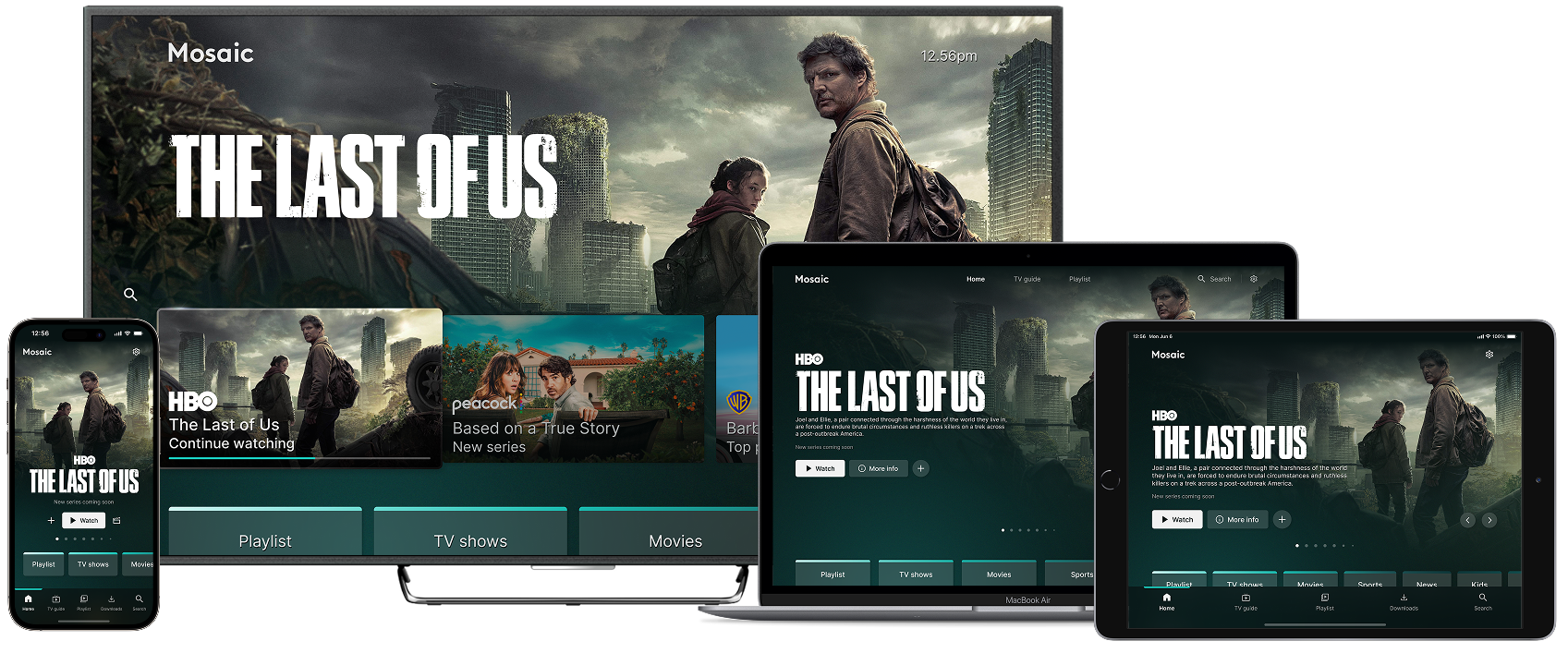
Multiple devices
The project began with designing a user interface for TV, where navigation patterns and screen layouts posed unique challenges. From there, I explored how the experience could extend to mobile, web, and tablet, each requiring its own solutions. By developing a unified design language and adapting interaction models for each device, I created a consistent, cross-platform experience that feels intuitive and connected."