
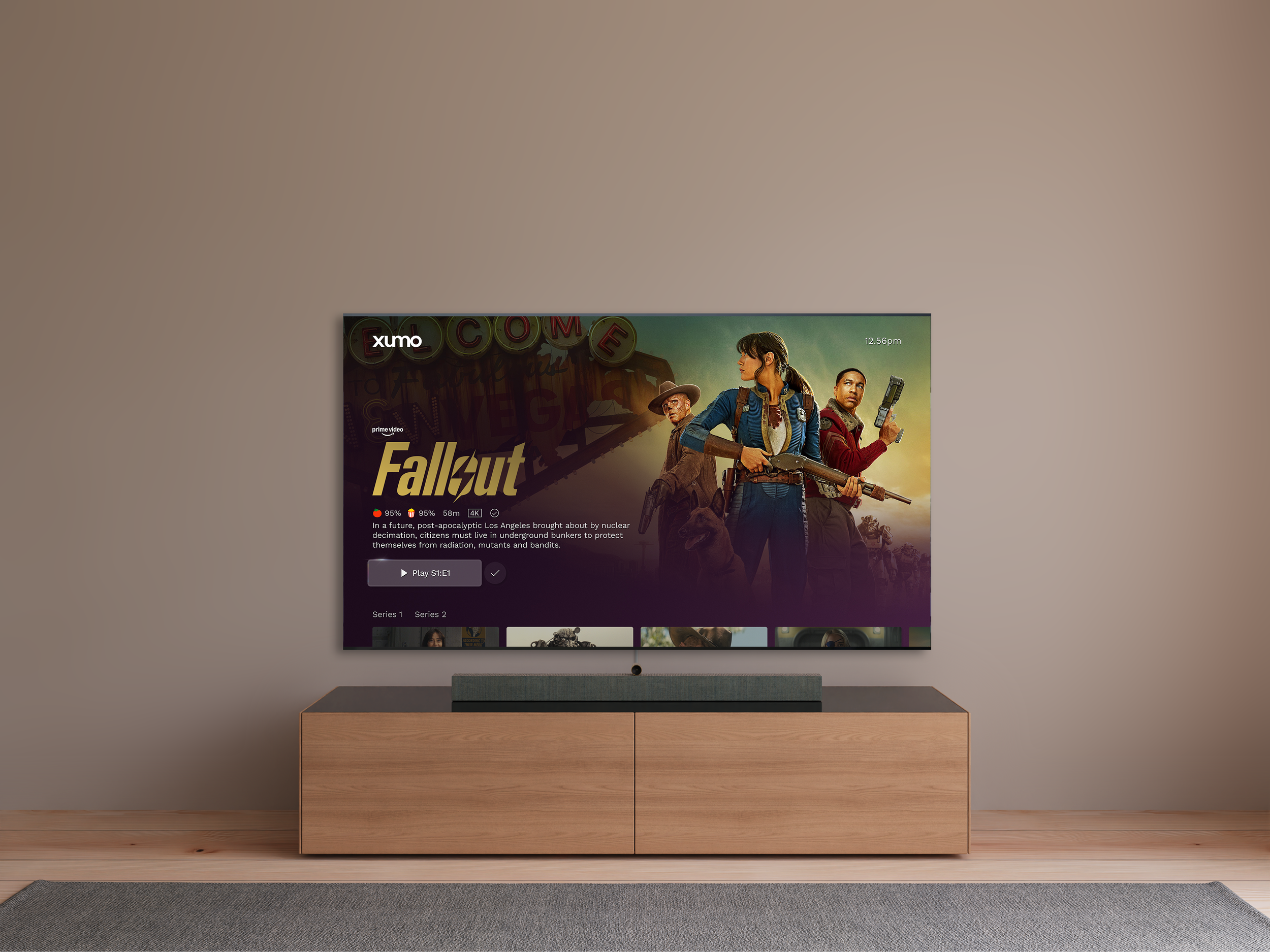
The showpage
Redesigning the launch point for content on the big screen.
-
Redesign the current show page across all device type to deliver a more immersive experience, improved readability with a clear hierarchy, and tailored show-specific rails for a seamless and engaging user journey.
-
We make products that create emotions and connect people to the content they love. We have the courage to go the extra mile to make things simpler, more task focused and easier to use.
This piece of work focuses on how we can enhance the hero zone (top of the showpage) to be more immersive and task focused. We have considered the hierarchy of components, the introduction of Title art as well as a new action menu. -
Lead UX designer. I worked closely with UI design and research to conduct moderated and unmoderated testing.
Requirements
When users land on the page, we want them to immediately feel like they know what’s available - no guessing. By designing with affordance in mind, we’re giving them a clear view of their options, whether it’s content, features, or functionality.
At the same time, we’re setting the stage for growth, ensuring we enable user features in the future. It’s a win-win: users get clarity now, and the business gets flexibility for the future.
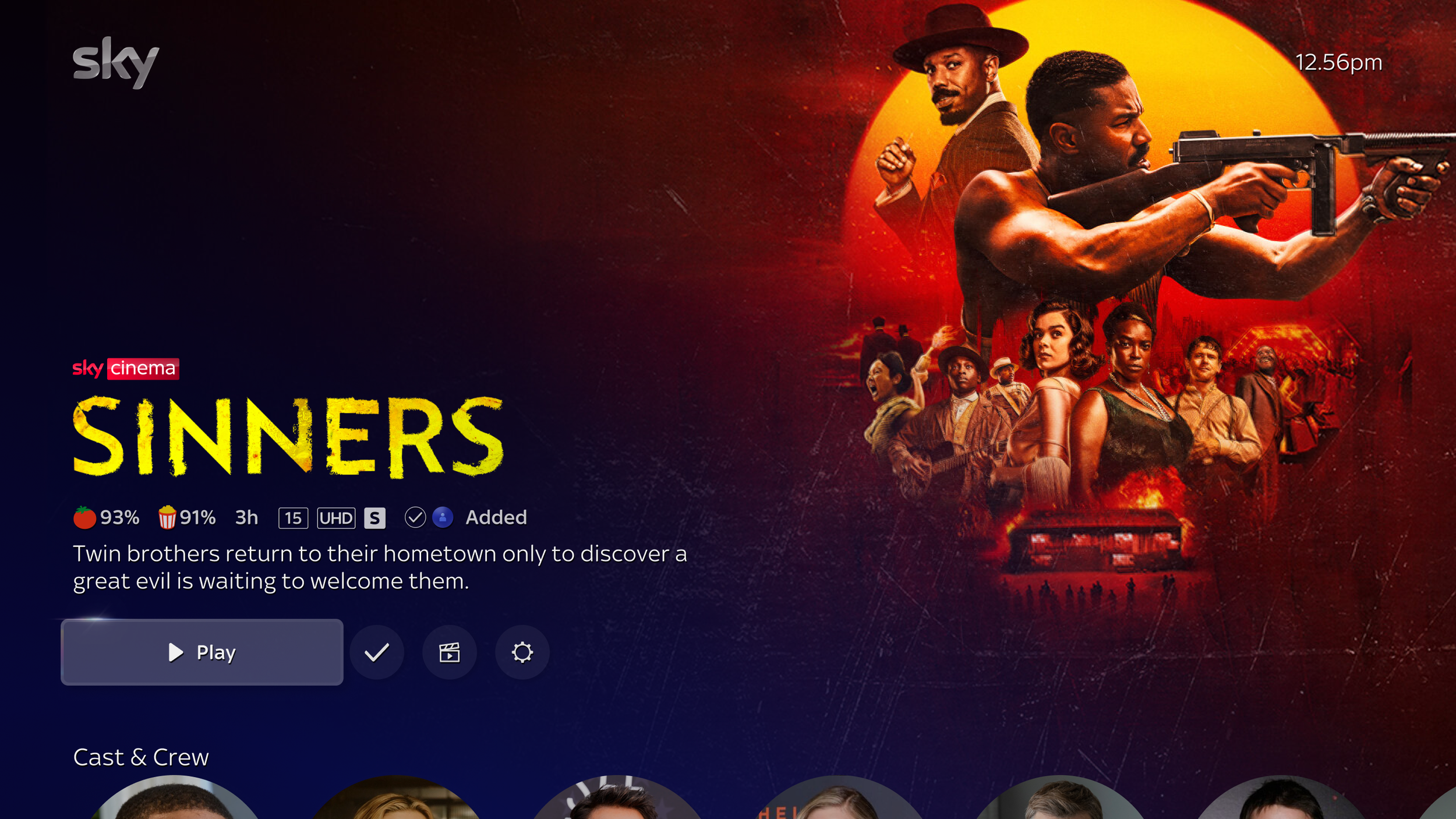
Content types
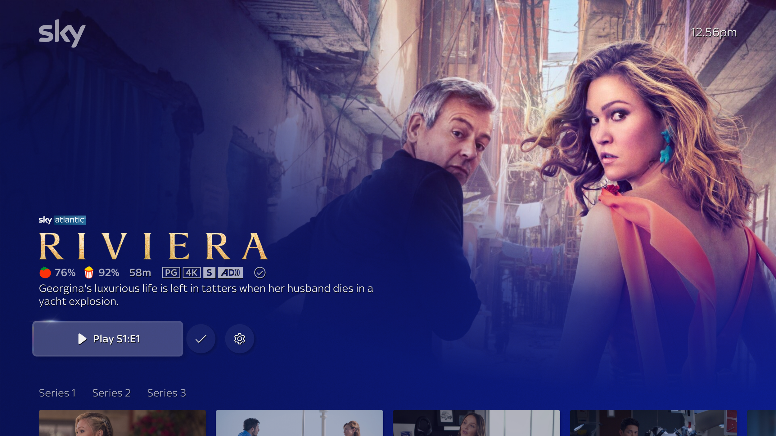
With a breadth of different content types the need for certain information takes priority for say, sports vs. movies vs. TV shows.
Cross platform
Exploring how the experience could extend to mobile, web, and tablet, each requiring its own solutions.
In developing a unified UX design language and breakpoints I created a cross-platform experience that gets the user to their goal efficiently, regardless of which device they’re on.
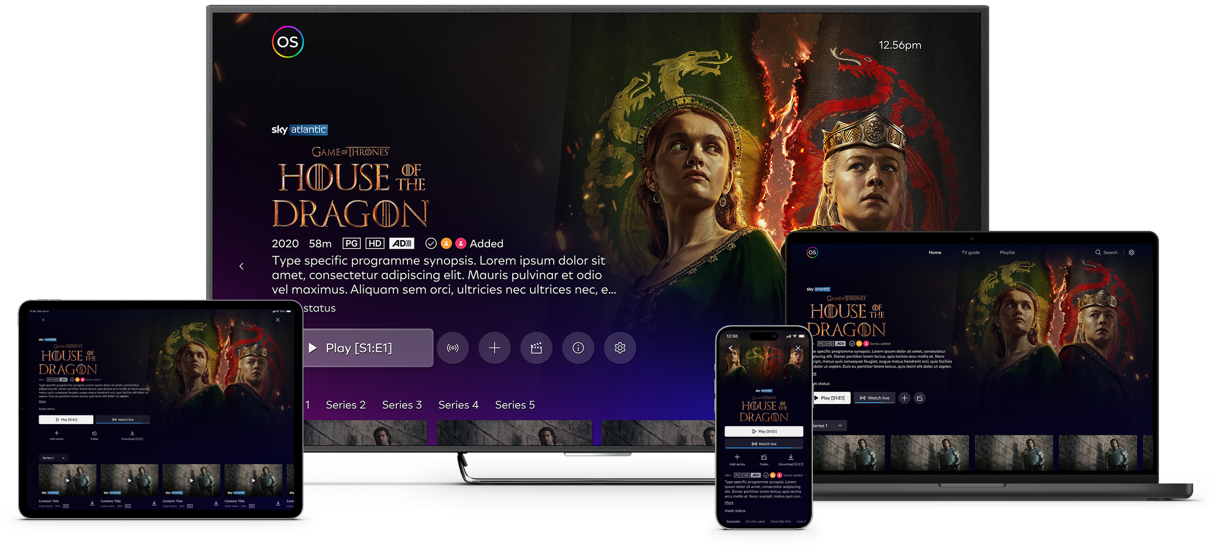
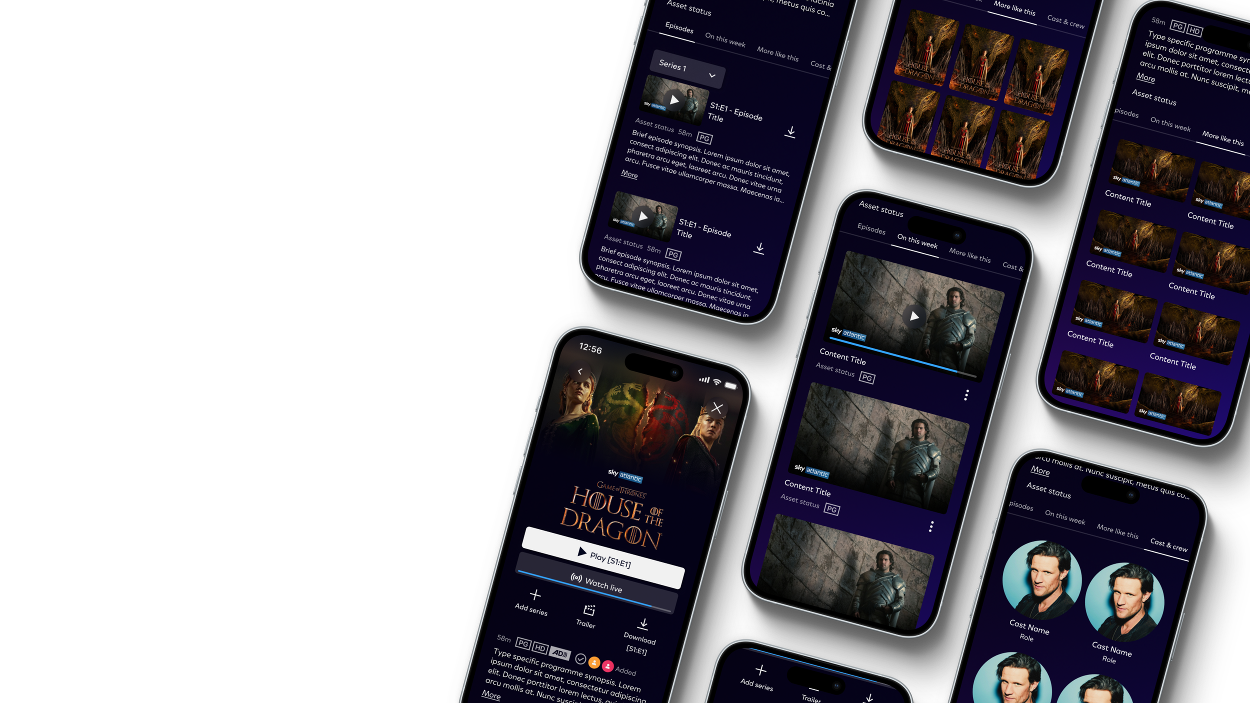
Mobile consistency
We want content types that feel familiar, intuitive, and coherent across all devices—mobile, web, and TV.
A UX-focused approach prioritizes clear information hierarchy, reusable patterns, and flexible layouts that scale gracefully from touch to remote to cursor.
What did we learn?
After multiple rounds of user research and past data we found the right combination and order of buttons. The user is here to play their movie, but they may also want to come back and watch later. The list starts to grow, and we need to think about flexibility using simple and known icons to get the message across.
User flow
Getting to the showpage is easy, so we focused on making it crystal clear that what options are waiting for them (think trailers, formats, and more like this). Plus, they need all the must-know details about the content right there, ready to go.